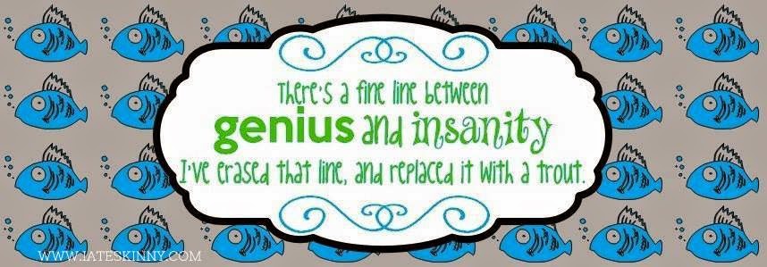
Facebook cover pictures. Let us take a second to discuss them. I absolutely despise using personal pictures for them, they're never the right size, they turn out blurry, something or someone always ends up cropped out in a strange way or cut out completely. I like things to be pretty and line up right, especially when it's the only thing other than my profile that people who aren't on my minuscule friends list can see. I keep that shit locked down like Fort Knox and I like to keep that baby under 100 if I can help it. Let's be honest I don't have
that many friends and most of the people on it are just there so I can shamelessly creep on their lives. If I've sent you a friend request, deleted you, and then sent you another one it's because I'm curious about what you've been up to since you last annoyed me into deleting you. Anyways, back on topic. My cover photo is the only thing that people can see to get a sense of who I am before I more than likely reject their friend request so I like to make it count. A few years ago I decided I wouldn't be using my personal pictures anymore and decided to go on a hunt of the interwebs for the perfect cover picture, because I'm lame and this is important business. I quickly realized people suck at making them. I couldn't find any that had everything I wanted on them. I didn't like the quote, or the font, or the picture that was used. They were pixilated, blurry, or distorted. Everywhere I looked it was like the crappy MySpace backgrounds all over again. I learned enough HTML to create my own backgrounds during the MySpace days because I couldn't stand the way to premades looked, so obviously I did what any semi creative internet addict would do and I created my own cover picture.
This was the very first cover picture I ever created by myself. I chose a cute little fish and copy and pasted until they were all pretty and even. I wasn't exactly sure what I was doing, but I had liked how it turned out and I used one of my favorite quotes. It had everything I wanted, the quote, the font, the background, and they all fit correctly. I've gotten a bit more creative and a whole lot better since then so I decided to share them with you today. Links to the correct size (851x315) are under each picture seeing as I had to shrink them to not screw with the pretty of my blog and are created specifically to not have any of the words interfere with your profile picture, name, or the add/message buttons. Minus the Doctor Who quote with the TARDIS, because I finally got frustrated and figured people would get the picture, I worked on that one forever. But here are my much better works, because sometimes I like to show off a bit.
Feel free to leave feedback if you'd like.
I always like to hear compliments.
If they suck I'd like to know that too so go ahead and tell me.
I promise not to cry.
Too much.


No comments:
Post a Comment
Stroke my ego baby!